About Map Portal
FarrPoint Map Portal
The FarrPoint map portal provides a central place for clients to access the maps, dashboards and visualisations that we build for them.
At FarrPoint, almost all our consultancy work involves a level of data-driven decision making or options appraisals, supported by analysis, mapping and modelling of datasets.
Our Map Portal is where we make interactive outputs of our assignments available to clients; so you can access them whenever, and wherever, you need to. This allows our clients the flexibility to visualise, manipulate and analyse their own data, often in the context of other datasets from a multitude of sources, hosted on the platform or streamed from live feeds.
Our maps and dashboards are used by various teams in a variety of ways, with the following benefits:
- Improved data-driven decision making,
- Better engagement with internal and external stakeholders,
- Increased efficiency and co-ordation between teams and organisations,
- Ensuring staff and organisations have access to the latest and up to date information
Maps
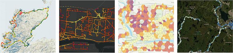
Nothing is quite as impactful as a map to describe a situation or problem. Our portal enables clients to interact with our outputs and combine this with other datasets from a wide variety of sources, such as socio-demographic information, detailed satellite imagery or open source data. Our maps allow users to select, filter, view and manipulate map layers, as well as compare datasets.Examples of our maps include the results of our Mobile Coverage Surveys, national mapping of broadband and mobile service availability, and infrastructure and asset locations.
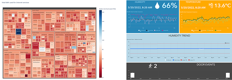
Dashboards
Our interactive business-intelligence dashboards allow users to investigate correlation between datasets, including spatial and temporal trends in data. At FarrPoint we strive to simplify large and complex datasets or models into the relevant outputs and metrics that address our clients' problems. Examples of our dashboards include monitoring of IoT devices and sensors, and presenting the statistical results of Infrastructure modelling or Mobile Surveys.
.png)
Visualisations
Sometimes a specific visualisation is the best method to demonstrate a particular correlation, pattern or trend. This is where our team becomes creative and these could take any form, in addition to the usual charts, maps and infographics.